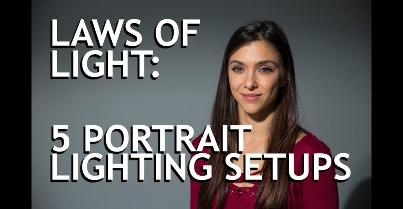
Laws of Light: 5 Portrait Lighting Setups
Jay: The five portrait lighting positions
are the key to all light on set. So if you don't know what they are or you
need a refresher, stick around. Hi, this is Jay P. Morgan.Today on Slanted
Lens, we're gonna cover the five basic portrait lighting positions. If you already know these, you're gonna wanna
stick around as a refresher course. If you don't know them, this becomes a foundation
for all lighting situations. It really, truly does. So I've got Keanu Barbieri [SP] over here
with me. You could follow her at… Keana: Instagram @oxsygin. Jay: Instagram @oxsygin. So, check that out. She's gonna be here. She's kind enough to sit and allow me to work
lighting positions on her in place. That sounds stupid, doesn't it? We're gonna bring this light around, got an
overhead camera that'll show us where we move this light.
I'm gonna try to talk about the, really, subtleties
of each of these positions because even though they seem pretty simple and pretty straightforward,
there are some real subtleties on what make these work. These lighting positions are tried and true. They are the things that people have used
forever. It also gives you an idea of where to put
your light when you're beginning to light a room or something.
Does not mean that your light has to stay
a certain hardness or softness. You can do whatever you want with it, which
gives you infinite number of possibilities as you apply these five positions. You can do so many different things with them
to make them interesting. So, learn these positions, learn how to apply
them. They're gonna become the foundation for most
of the lighting decisions that you're going to make.
So let's take a look at a Rembrandt. Rembrandt truly liked that dark shadow, and
as he would look at light coming through a window or whatever light source he was using,
he started to see that the nose naturally makes a triangle on a person's face. First off, this Rembrandt here, it's way too
low. So this light's gotta go up, up, up, up, up. When I get this light in the right position,
her nose closes the loop that's underneath her chin here so her chin shadow, this nose
shadow, breaks into that chin shadow and creates a triangle. That's a true Rembrandt, a very pretty light. Now, I can take and fill this, just a little
bit of light. I can fill this. I can make this a very flat Rembrandt, you
know? I can pull it out and make it kind of shadowy
or we can just let it really be deep.
It really depends on what you wanna do. So you have all the options in the world. I can fill this from underneath if I want
to favor opening up the shadow under her chin. I can really do whatever I want. If I fill it from behind, I can almost take
my Rembrandt and start to get myself a little bit of hair light on her. So it becomes an easy transition into other
different kinds of lighting, but a Rembrandt becomes our first one. The number one lighting position is our Rembrandt. Now, again, she's turned away from the light. Her shoulders are turned to the light but
her head is turned back to the camera, but now that gives me the opportunity to create
what's called a split light.
A split light is simply splitting the face
right down the center. So I'm gonna bring this light way around. I'm gonna use my Rocky Mountain leg here with
my Kupo stand. Whoop, we're falling apart over here. The reason I like Octodomes versus square
boxes is very, very simple and that's just simply I like the round highlight in the eye. That's why I like them and I think they're
a great choice. A square box is square, a round is round,
feels more like lighting sources that we see. It looks right in the eye. So there's our split light. We've moved the light way around to the side
and then now the light just simply does exactly that. It splits the face, highlight, shadow. There's no bleed of the light around onto
the side of the cheek, we're still looking into the shadow side of the face. If she turns her face into the light now and
there comes a Rembrandt. Chin down a little bit, there you go.
Now, look back and come back this way here. So we're going from a Rembrandt and to that
split light. So those two transition pretty easily. Split light to Rembrandt to a broad light,
very easy to kinda transition between those three lights. When you get this in the right position, they
look fabulous. So, again, I can open this up the side of
her face, gives me the ability to really open that up. And if we wanna flatten it out, I can really
get in there and flatten it out as well. Again, I can try to do something that opens
up a little bit of her hair and gives us something to look at there. So there's a split light. Now, if we simply take her and turn her legs
away from the light, and now she's moved her position, looking away from the light, she
looks back into the camera now, we've taken that split light and it's turned into a broad
light. We're basically looking at the broad lit side
of her face through the camera. The camera's looking at the side of the face
that's lit.
It's a position that is used all the time. I don't think it's the most interesting. I like to look into the shadow side a little
more than I do the broad side, but it's certainly a position that looks very nice. If I fill this correctly, this broad light
can be very pretty. We push in with this, we get just this open
kind of lit. It's like really bright highlights on the
broad side of her face and then a nice open look on the shadow side when you push this
card way in.
Just let it really open up and fill. Again, we can come up in the back, try to
get a little light on her hair or we can even come in underneath, if we want, which changes
the look a little bit. And there's a broad light. You see the broad light used all the time. It's a very, very common light but probably
not as much as a Rembrandt or a split.
Now, we're gonna go to what's called a butterfly
or a Paramount light. Why is it called a butterfly or Paramount
light? Well, it's called a Paramount light because
back in the '20s and '30s, the light, a lot of the actresses wanted to have a Paramount,
which is a high light overhead that gives us a little kind of butterfly underneath the
nose, that's why it's called a butterfly light. A lot of actresses had this in their contract. They couldn't be photographed unless it was
with a butterfly light. So a butterfly light is very easy. I'm gonna take my light, I'm gonna move it
all the way around. I'm gonna slide it right next to my camera
here and I'm gonna get Keana to look right back into the camera. There's my butterfly light. This is a beautiful light for women especially,
because what we get is we have a high light, runs the nose, drops this beautiful shadow
underneath the nose and sinks the cheeks. We get a little bit of shadow on each side
of the cheek.
It's a very common light to use with women. It just looks really pretty. I mean, looks great on men as well but it
looks great, especially beautiful on women because of the cheeks and the cheekbones. If I'm in a hurry, if I'm in a tight situation,
I need to light fast, I've got a group of people, throw the light up next to the camera,
get it up high and get in that butterfly position and it looks really good. It's a great go-to light in a hurry. When you start to get the light to the side,
you got a group, becomes very difficult to get it to be even. You've gotta feather it and just work with
it a little more. But at the camera, high, you get an easy butterfly
light with someone and it works out really simple. If I take this light now and I drop it down
lower, I can almost flatten her face right out because I'm right above the camera.

It's not my favorite place. I don't think that works as well as it can,
but it's interesting. I think a butterfly light is nicer when you
get it up. Get it up a little higher, start to see that
shadow develop underneath her nose, and that's a prettier light. Now, I'm gonna take and just take my fill
card and the best place for this now is to come in from underneath. I'm gonna reflect that light back in. I'm gonna open up the shadow under her chin,
under her nose. That's the hardest place, is the chin shadow. It becomes very deep in this. That's why some people do what's called a
clamshell lighting. You got a light up in a butterfly position
and you throw a soft box below, it just opens up the shadows. You put that on a lower setting, it opens
up the shadows beneath the chin, underneath the nose and just kind of flattens things
out a little bit but looks very, very nice.
You see clamshell lighting all the time. But this acts kind of like a clamshell light,
in that it's bouncing back in. Clamshell is just simply two soft boxes. You look in her eye, you can see that round
catch light in her eye. That gives a sense that she's alive and not
dead, so you want that catch light. So this Octodome has gotta be up a little
bit to give us that nice shadow. Too low is too flat, too high starts to deepen
her eyes and that nose shadow starts to drop way onto her chin. We don't want that. But now, let's go to the last one. It's called a loop light. It's a loop light because it doesn't close
the loop on to the chin to become a Rembrandt.
It's a loop that just kind of dies into the
cheek. Don't want it straight across. So if I bring this around for a loop light,
I'm coming all the way around here now. And I can loop this from either side, it doesn't
have to be here or there, up or down, in or out, in a box with a fox. So I can do a loop light from this side but
because of this white wall, it's just killing it. You don't see it very well. So I'm gonna take this back around to the
loop position. Difference between a loop and a Rembrandt
is the loop light's gonna be a kind of in between the two and it's gonna be a tiny bit
lower. So when this light's too low, this is not
a loop light, even though I've got a shadow coming off and somebody will say, "Oh, well
that's a loop there," no, that's just a broad deep shadow along the side of her nose and
has no interest at all.
So bring this up a little higher and around
a little bit here to the front. She has such a petite nose. We don't see a really heavy loop light on
her face. I'm gonna bring this up just a little bit. Now we see this loop's starting to develop
on the side of her nose there. It gives us a nice bridge line, shadow line
on her nose, a nice loop off to the side but doesn't close it, doesn't turn it into a Rembrandt. We still see a highlight in there, so that
loop just kinda starts to dive into her nose and into her cheek. So, again, very easy to fill this.
Make it as flat as we want and open. It's fascinating because every single face
is different. You think, "Oh, that person looks great. I look great with this." It's like, they don't. It just, I mean, they may or they may not
but it depends on the size of their nose, it depends on the way their cheekbones are,
depends on how sunken in their cheeks are. Every single thing is gonna be a little bit
different. So, as you're lighting a person, look at their
face, think about the different portrait positions, position it, experiment a little bit, height,
just keep moving around and experimenting. Don't get yourself locked into, "Well, I threw
the light up in this position so it's got to be there." Move it around a little bit. When you start to learn where to put them,
you'll be able to predict that a lot easier.
You'll get it in the right place, it'll come
a lot quicker and you'll be able to see it a lot easier. So, in every single one of these lighting
positions, we're only using one light, that's the key light and using that and putting it
in the different lighting positions and that becomes a very successful experience. It's a key light with a fill card. So these are really one light solutions, one
light solutions to give you the ability to give you a nice light and with a single light. You start making decisions with these positions
about the person's face and what you want to portray. If I want a person to look very good and to
be open, then I'll probably go to a butterfly with a fill card and really soften that out
so it looks really open and soft and pretty. Also, the size of the source is gonna make
a huge difference.
This is a pretty small source. A larger source is going to make this Rembrandt
wrap more. So the light's gonna see into the Rembrandt
more and the shadow side is gonna be filled a little more than it is. So, by adding a large source, this Rembrandt
can be even…it can be opened on the shadow side. By adding a smaller source, you can make this
Rembrandt even harder. If I take this box off, which is really easy
to do… You gotta be kidding me. I knew how that worked. So there's a Rembrandt in a hard light. This is a hard directional light. You can see it much easier. The triangle is very easy to see there. This is also very easy to fill, though. The difference between hard and soft light
is simply the transition between shadow and highlight. When your highlight to shadow is very quick,
it's a hard light. If your highlight to shadow is very slow,
in that there's a gradation, slowly becomes from highlight into shadow, that's a softer
light. So, in this case, we have a very fast transition.
We put this in here and it really flattens
out her face, gives us a nice look at that Rembrandt. You can see all these lighting positions with
that much easier because there's our Rembrandt, we go into a split
down to a loop light. See that really strong loop there? So there we go, we can fill that in. There we go and then we go to our butterfly. So there's our butterfly in harder light. A little easier to see. See the hard shadow dropping underneath the
nose? Really easy to fill in because we throw this
in, opens up her chin, opens up her nose. Now back for a broad light, which we forgot
about. There's our broad light from the side. You look into the broad side as she turns
away from the camera. So, it's interesting because look at the eyelashes
on her, you see her eyelashes are very strong on her nose line there, that's just because
this is such a hard light. You see right down the shadow of the eyelashes,
which is really interesting. So there you go, the five portrait positions. Use them as a starting, a kind of a jumping-off
point.
When you start to set your light, gives you
an idea where to set it, how to make the face look good and then start to fill it and augment
it. Now, this is just a single light setup here. we could take this so much further if we start
to add a rim light and add a light on the background. There's so many things we can do, but that
gives you a basis to get out there and start lighting. So, put some images up on our Facebook group. Show the different positions, call them out,
show them to your friends so that we all can see what you're doing.
We want to hear from you, so go over that
Facebook group, follow us on The Slanted Lens and keep those cameras rolling, keep on clicking. It's March and we're giving away a Tamron
35 millimeter 1.8 lens. It's a prime lens, a great lens. To win this lens, you've got to go to Tamron
and The Slanted Lens and follow us both on Instagram. Post your story and tag both Tamron and The
Slanted Lens and that'll get you in to enter as well.
And last of all, tag a friend in the comments. So it's a lens for Instagram here. It's a lens for Instagram. It's an Insta-lens. It's a grama-lens. A grama-lens? My grandma used this lens. No she didn't. So get out there, tag and follow. [00:14:31]
[music] [00:14:46] Keana: Subscribe. Jay: To The Slanted Lens. I was off balance..


