EXPERT Vs AMATEUR GRAPHIC DESIGN: Before & After Real Life Examples
so as i go along in today's video we're going to
learn about some really crucial and helpful tips on before and then after in terms of graphic
design work you can test your own knowledge and how you would approach each and every design
and see how it fares to my decision making in my graphic design workflow and we're either going
to be making a trip to canva because i found a pretty hideous logo that i thought would
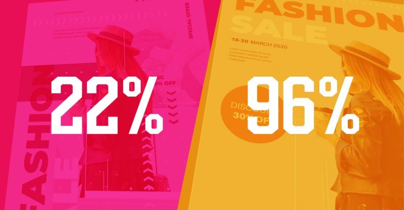
be fun to quickly change and redesign but first up we have this sale poster that's fashion
orientated and it's something i found on freepik so i want you to take a look at this poster design
and all of the knowledge that you've soaked up and absorbed from my channel or other channels on the
internet or just anywhere in terms of educational graphic design content think about what is wrong
with this poster when we're making changes to a design we want to first identify the problems
that need to be resolved and let's be honest with this design here there are quite a few problems
going on so the first thing that i identified as a big problem in this design was clutter there
are too many things going on which makes it too convoluted too complicated and too busy when
somebody views a design especially a sale poster that viewer needs to access the information
as quickly and as easily as possible and there are so many different ways that
this design is cluttered and too busy for the first step here i have removed some
of the background imagery as you can see and also the dots because i thought they were just
insignificant and they're just creating confusion but there are still a lot of things that i would
change about this poster and i'm going to do that as well but i want you to think what would
you do and what kind of steps would you take to refine and improve this design i've made
quite a few changes on this third step and it's still not finished but as you can see i've
put that fashion sale title actually reading in a horizontal format instead of going vertically
which i think is too convoluted you know also i've really cleaned up the poster in general
and it's really refined down to a simplistic form i've put most of the key information in the
top left and i put the main focal point of the woman in the bottom right again this
creates a kind of division and some balance and also you can think in terms of proximity
now the information that suggests the 30 discounts i've put this in a circle so it
stands out and is really easily recognizable but yeah the main problem in this design
well actually there were two main problems in my opinion one of them was things were just
way too busy and too hectic and the second was that the information was displayed in a very
poor manner we have dates and we have you know websites and textures all over the place and it's
just it's just crazy and this actually was how it was downloaded the only thing i had to change
was that on freepik it didn't come with the female model it did show a model but the ai file
doesn't come with one so i added one myself but there are still a few minor changes i would make
to this design which we're gonna check out now and so finally here we have the design on the
left is the before and on the right is the after i have chosen a kind of muted red which i do think
works really well for a kind of sail design but the kind of bluey green did work but i do think
this is a good choice let me know what you think about my design on the right compared to the
one on the left and let's move on to the next design again we have another free pick edition
and this is a kind of a save the dates card that will be giving out to people attending or
potentially attending a wedding so do take a look at this design and consider what would you do to
change up this design and make it more effective like i said before look at the design and
try and identify the key problems that are going on here and that's a good point actually
when you're considering your very own design work be critical and look at it and think what is
the problem what is not effective here how is the information not being communicated efficiently
when you start doing this on your very own graphic designs that is when you will level up
in your career now the first change i made was the font confusion on save the date it was laid
out in a very strange way you know aligned to the right edge and also using three lines and also
different fonts so i've gone ahead and enclosed that with two lines one above and one below
and i've used one standard single serif font at the very top i have the occasion which
is the wedding of and then the name of the bride and the groom and i'm added a little
motif of three dots which i think works well and then for the date itself instead of using
this kind of complex layout they had before i've gone ahead and just put the dates in
simplistic terms and yes as you can see on the right hand side on the original design the free
pick ai file did come with a typo as you can see in the bottom it says one two three yalt instead
of your place and so to make it more based around a relationship and a wedding i chose the
address of 123 love street queens new york but yeah as you can see things just look a lot
more together and refined in my design on the left and so for the third edition in today's video
i was looking around the canva which is a free resource where you can edit and make designs to
a certain extent using their built-in templates and i noticed that canva actually have a
logo design section and so i checked it out and then i stumbled across this quote unquote
logo design yeah it is a free template it is a free logo so it's not going to be outstanding
but i thought it'd be quite fun just to make some changes i know before anybody jumps down my throat
i didn't go through the design process because that would take many many weeks or at least many
many days i'd have to create a brief then i would have to make initial keyword concept ideas
refine these ideas and so on you guys know the process you know how it goes so the first thing
i did was take that word steeple which refers to a kind of a church or a building a spire at the
very top and i thought how i could incorporate that into a very brandable simple icon and so i
came up with this arrow or should i say a more of a steeple refinement and it could be used in
an enclosed circle or it could just be used by itself here but we should all realize the main
issue of the previous logo was that typography the typography is not only pretty ugly beforehand
but it doesn't scream brandability and if you have that kind of calligraphy style lettering
with the fashion forward below together it just doesn't work very well it kind of comes
across as confusing because the calligraphy style writing is really informal and it's kind
of personal and then you have the really serious uppercase fashion forward below and not to
mention there is nothing really iconic about it and so i went for a very straightforward
sans serif logo type option and i do think that the design on the right will be a lot
more recognizable than that on the left as you can see on the right now you can imagine
how this would be very brandable and very iconic say in a magazine or anywhere and in terms of
logo design this is what you need to consider you need to consider how brandable is it how
iconic is it and is it going to be memorable but also it's important to know the use and
the application of your logo where is it going to be used how is it going to be perceived in the
scene and so forth and then for the fourth design today we have a kind of a design for someone
who works in a company now this one is going to be quite subtle because there isn't a lot of
things i would change to this design but i would suggest there are two key areas that i think need
to be addressed and changed or potentially changed so looking at this design what two areas would you
consider addressing and paying some attention to so the first thing i did was to remove a
pet peeve of mine and that is a drop shadow yes drop shadows are relevant and useful in
some situations but for me personally a lot of the time they're just not needed a flat design
is a lot more easy going on the eyes and it does work better in most situations so that's the first
thing i did i completely removed the drop shadow from the design altogether secondly if you notice
on the left hand design in the bottom left corner things are a bit too spread apart and they do
take up too much room so i thought they could be refined down more so and that is exactly
what i did i kind of crunched the typography together a tiny bit and i ensured that it was
still legible but also that it now gave more room to the rest of the design i also made the qr
code a bit smaller and i made sure it was still going to be functional even though it's a tiny
bit smaller now everything that you've seen in today's video is not set in stone but this is how
you should approach a design or even your own work when correcting things or refining them you
need to look at things with a critical eye and see where's the problem why is it the problem
and how you can resolve that problem i posted something on my community tab last week saying how
i've been burnt out and just a bit low recently and i really appreciate all of the great feedback
and the well wishes and just the kind response i got from that i wasn't fishing for sympathy
because let's face it all of us at some point in life have very low points and especially
in 2020 and the start of this year as well but to see all of the love and the kindness out
there it's really heartwarming and i really want to say thank you guys for just being there but
yeah if you want to see more content like today's video just click the video on the screen and until
next time guys design your future today peace you


