Amatuer / Pro / Master Graphic Design (What It Really Means)
amateur Pro Master graphic design you might feel
like your work is somewhere on that Spectrum but what do real graphic designs look like in these
three categories we're first going to look at business cards now when I say amateur in this
video it doesn't necessarily mean a bad design it's more of an entry level or beginner type of
design this card is actually really neat but we need to think about context here what is the
purpose of a business card it needs to inform someone about your business or your client's
business and it needs to be memorable and impacting enough not to be chucked away or lost by
whoever receives it this design here is somewhat forgettable albeit neat and technically okay the
information is easy to access and it's a decent design sure but then we look at this card the Pro
Design we can see how this would be more impacting if you were handed this by someone it would for
sure be a unique thing to hold and to look at the texture the translucent finish the design itself
being really neat as well this card just has a greater chance of leading to business for those
reasons but you're probably asking yourself how can that design even be topped like what is the
master design looking like it isn't just what it looks like but what it relates to this design is
smart it's memorable and importantly it's relevant the business card is for a photography business
and most of the card acts like a viewfinder on a camera if you had this in your wallet or your
purse you'd feel like you have the details of one of the most professional and unique photographers
in your hand you can imagine whoever you give this to would play around with it and maybe show
their friends which is the ideal outcome so yeah this is a truly Master Level design and we love
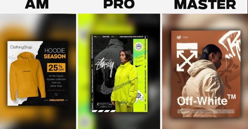
it so next we're going to look at three designs that aim to advertise a clothing brand or like
a fashion kind of brand and we're going to see what the amateur the pro and the master designs
look like in that Niche starting with this design right here the amateur design now this design
does a few things correctly it has a strong color palette the text is somewhat neatly laid
out and we have a nice balance between the focal point of the clothing and then the information on
the right it's an okay design it's just typically amateur I would change the font choices edit the
layout in some areas and a few other things but a Pro Design well that would aim to do a whole
lot more than just that this design firstly has a real person on it and that makes it instantly more
relatable to whoever sees it thus increasing sales and interest into this fashion the design has a
stronger visual language than the previous one where we have a very Urban and Youthful Vibe
happening here that is made up of graffiti style Graphics modern sansera fonts bright colors
and all of this plays into that youthful target audience so the design is basically more advanced
and more thought out compared to the previous one but this design is still kind of messy and a bit
poorly laid out this design however for off-white smashes it right out of the p back again we have
a person who represents a target audience but the design is a lot cleaner the focal point is front
and center and the palette is more refined as well it's very clean very crisp and yet we still have
a strong Urban and you visual language happening it just hits different this is the Master Level
design of this section for sure so when you've got your design you finished your work when it
comes to pitching that design and showing it off there are different tiers and different skill
levels even in that kind of field of work so here we have the amateur approach of showcasing
or pitching a logo design now for this past the logo presentation what do you think might be
missing here or why do you feel like it's only amateur level I mean we do have the logo shown on
clean and relevant mockups the presentation itself doesn't look bad as such but the key thing missing
really is background information on the project the clients and the logic behind the logo design
itself we are simply showing the design and we're not given any background information on how it
was made or why it was made and this is a failure to demonstrate knowledge on the designer's part if
we however look at this presentation the pro level presentation we start with the logo shown at the
top again but then we have some brief background information on the client and their business this
gives us some text and then we do get to see the logo in different situations and on different
mockups but still this is only a prevel design as much as it does look slick and crisp we probably
do have too many mockups and too many views of the logo after you've seen it what say 10 times
you don't really need to see it again and also the designer has failed to provide any logic or
anything in terms of the process they went through in making the logo itself that's where where the
Master Level presentation comes into play so again we start with the logo at the very top and then
some information on the client below but if you read here we have crucial logic and reasoning
behind the logo design itself it says about how it aims to solve certain problems for the client
and this is taking things to that next level and it's a really useful thing to include here we also
have some information on the color palette Choice which is shown in bright and clean graphics and as
we scroll down you will notice that the designer hasn't overloaded us with too much to look at it
uses just the right amount of visuals to show us what we need to see before it gets too kind
of overbearing so next we're going to look at three tiers of landing page design as of course
again in the amateur the pro and the Master Level here's the first design and obviously yeah this is
a template but why is this just an amateur design well it's not really inspired is it if you
landed on this landing page while scrolling the internet would you feel encouraged to learn
more about this breakfast or whatever it is we have a generic illustration matched with generic
layouts this would not capture attention or lead to many sales at all and so we must move on to
the pro level landing page design just to see what it's all about so this is a very cool and a
very neat landing page for a tech-based company the design is very modern it uses highly modern
fonts clean graphics and a modern color palette and it just looks professional simply put now
I would prefer the call to action to be maybe a different color as it does kind of get lost on
this design and the layout is a bit cramped in some respects but it's still miles ahead of the
previous design we just looked at and looking at this design I am more inclined to learn more
and see what the company has to offer and what they're all about about but how does the Master
Level design improve on this already pretty good pretty decent design this design is really a
masterpiece and yes sorry about the quality of it I just couldn't find a better version but
notice how the layout is cleaner than the previous one there is a better use of white space which
is really crucial when it comes to websites or landing page designs and that's because the user
can navigate the page and access the information a lot easier the CTA also stands out more here
than the previous design mainly because it has more space around it than anything else
I love the crisp and the fluid lines on this design and the palette is really strong as
well but do you agree with the rundown of these designs in terms of the three tiers that we spoke
about let me know with a comment in the comment section below but if you want to learn more about
graphic design and perhaps move up a tier or two then just click the video on screen but until
next time guys design your future today peace a [Music]


